After Aurelien David, Soraa's Chief Scientist, released the last blog’s primer on the concept of color saturation, he takes a look at its implementation in products. For simplicity, David’ll talk about “enhancing” colors in this post—what he really mean is “increasing the saturation” of colors, an effect which tends to be well-liked in some situations.
A variety of color-enhancing LED sources can be found on the market; but to the extent I can judge competitor products with fairness, I’ll say this—I’m not impressed by what I’ve seen so far. In short, these products often have a not-so-pleasant way of saturating colors and a pinkish light tint. I suspect a lot of this has to do with the color science tools used to design them.
The goal when designing such sources is to boost colors “just right”; so that they look pleasant, but not unnatural. To date, the most widespread tools to guide this exercise are the CRI (for color fidelity) and the Gamut Area Index, or GAI (for color saturation). Manufacturers seek a fairly high value of GAI, while keeping CRI not-too-low. Unfortunately, these two tools have some flaws. We have already discussed the shortcomings of CRI in past entries; but in today’s context, it is the properties of GAI that are most crucial.
The first difficulty is that the GAI, only being a single number, tells us about average color saturation, but not which colors are being saturated. As we will see soon, this is just not enough information. The second issue is that it uses obsolete color science (in particular, a very non-uniform color space), which overly values the saturation of some colors—especially in the blue range. And finally, CRI and GAI have been created independently and don’t use the same calculation principles, so that the fundamental trade-off between color fidelity and color gamut is not evaluated accurately.
The practical consequence of these factors is the following: to raise GAI while maintaining CRI, it is easiest to add a lot of blue wavelengths to a spectrum; this creates light with a pink chromaticity (below the blackbody locus), which boosts the saturation of yellow and blue tones and pushes the GAI value through the roof. However, while the resulting source gets a high grade according to CRI and GAI, it may not be all that pleasant in practice. The question of chromaticity is a complex one, which will deserve a separate discussion. In some cases, a below-Planckian light tint is indeed pleasant; however, a metric that pushes you in that direction without solid reasons is problematic. Besides, yellow and blue color enhancements are usually not that well-liked.
For a long time, GAI was the only tool around to evaluate color gamut, and its existence was very fortunate despite those technical issues. But today, we have at our disposal better tools, in particular those offered by TM-30, to address these shortcomings. Rf and Rg (which respectively update CRI and GAI) use a consistent calculation method, so that the trade-off between fidelity and gamut is accurate. They use a very uniform color space, so that there is no bias for particular colors. In addition to Rf and Rg, TM-30’s color icon gives us precious information on specific color enhancements.
As a first benefit of TM-30, there is less of an incentive to pull the chromaticity of the source towards a pinkish tone: rather, we are free to manipulate chromaticity and color enhancement independently. In particular, it is possible to design a spectrum having a strong saturation enhancement while remaining on-Planckian.
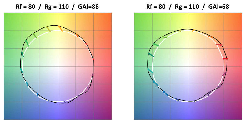
The other substantial benefit is that the color icon lets us properly explore a crucial question: which colors should we enhance, and how much? Consider, for instance, the two sources of Figure 1. Both have a similar fidelity Rf =80, and color gamut Rg = 110. However, they obviously have a very different impact on color: one enhances yellows, the other reds and greens.
 |
Figure 1. Two sources with the same values of Rf and Rg, but very different color distortions. Notice that despite the identical Rg scores, the second source has a much lower GAI. (All photos courtesy of Soraa)
|
We may wonder if both would be equally well-liked by users. As with anything related to preference, there isn’t a systematic answer. However, research has demonstrated that in practice we are most often sensitive to saturation enhancements of warm tones (such as red orange, pink and skin tones)—this means the second source of Fig.1 is much likelier to elicit user preference. Notice, however, that GAI is much higher for the first source (because its spectrum happens to have a large blue peak): therefore, using only guidance from GAI, we might wrongly conclude that the first source is probably “better” at color enhancement.
 |
|
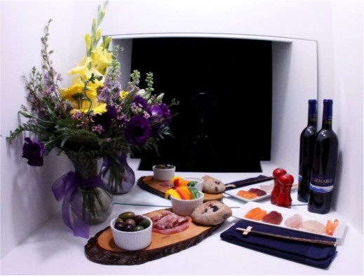
Figure 2. The restaurant setting in the PSU/Soraa study. |
Our preference for saturation of reds and warm colors has been known for some time, but not in a very refined way. Recently though, Soraa explored it in greater detail by teaming up in a research collaboration with Penn State University. Using guidance from TM-30, we designed a series of color-enhancing sources in which the direction of color enhancement was finely varied, and asked observes for their preference in a restaurant setting (Fig. 2). The results quite clearly identified that some objects (again, mostly warm tones) mattered the most, and more importantly, that color enhancements with a specific direction and magnitude were most-liked. This is where the fine-grained information of TM-30 is important. The color icon lets us understand color distortion in great details, and distinguish between subtle “flavors” of color enhancement. As an illustration, Fig. 3 shows three enhanced spectra: all enhance warm colors, but in different ways, and observers preferred one of the three. For those of you interested in more technical intricacies, the full results of this research have just been accepted for publication, find out more here.
 |
|
Figure 3. Three sources investigated in the PSU/Soraa study. All have similar values of Rg, but enhance warm colors in a different way. In a restaurant setting, the source on the left is the preferred one. |
Soraa’s new Enhance Snap filter, which transforms our high-fidelity Vivid lamps into high-gamut lamps, is largely an outcome of this study. It has been crafted to enhance warm colors in the specific way that we determined was optimal. At the same time, it leaves the chromaticity of the light on-Planckian. This is advantageous in an installation where color-enhancing lamps are mixed with high-fidelity lamps: all sources retain the same chromaticity, and some lamps can locally enhance colors according to the lighting designer’s intent. And finally, Enhance retains the perfect whites rendering of our other sources. In our opinion, Enhance really stands out in the landscape of color-enhancing products. I hope that this story gave you a good idea of why trustworthy color metrics matter for researchers and manufacturers: we need tools without bias, which let us qualify the properties of light in an objective way to guide us in designing research and products. We have found TM-30 to be of great help in this.


 CN
TW
EN


